
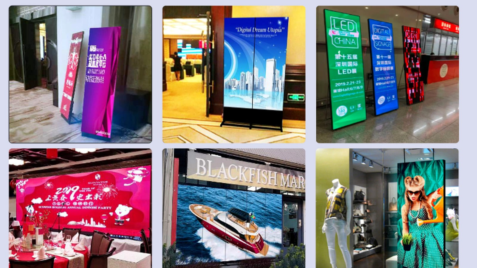
A digital display creates the possibility of change, but that does not automatically make the content effective. The strongest installations are commissioned with a clear plan for what will appear on screen, who will update it and how it should behave within the space.
Design for the time people actually have
Someone walking past a blade sign may offer only two or three seconds of attention. A person waiting in a lobby may have considerably longer. Content length, type size and motion should reflect that dwell time.
For short encounters, one message per frame is usually stronger than a composition filled with detail. Longer-form information belongs where people can stop comfortably and read without obstructing circulation.
Match the content to viewing distance
Typography that works on a laptop can disappear on a large display once it is viewed across a room. Important information should be tested at the real installed size and distance. Contrast, letter weight and safe margins all matter.
Portrait displays often suit single images, simple offers or directory information. Wide displays support cinematic movement and spatial compositions. Multi-sided displays need content that remains coherent as viewers approach from different directions.
Build a useful content rhythm
A practical playlist often combines a small number of content types: a primary brand or campaign message, product or project imagery, useful information, and quieter ambient sequences. Repetition is necessary, but the order should avoid feeling mechanical.
Transitions should be restrained. Motion needs enough energy to attract attention without becoming distracting to staff, guests or neighbouring tenants who experience the display for hours rather than seconds.
Calibrate brightness and colour
Content should be reviewed in the actual lighting conditions. Large areas of white can produce far more apparent brightness than dark imagery at the same screen setting. Evening operation may require a different brightness profile from daytime use.
A palette drawn from the interior can help the display sit comfortably within the space. Brand colour remains important, but it should be balanced with the materials, lighting and atmosphere around the screen.
Decide who owns the display
Before launch, assign responsibility for approvals, scheduling and routine updates. Establish file formats, aspect ratios, maximum durations and a simple naming structure. A modest library of well-prepared content is more useful than a complicated system nobody maintains.
It is also worth planning for quiet periods, expired campaigns and loss of signal. A considered fallback image prevents a blank screen or error message from becoming part of the customer experience.
Treat content as an operational asset
Hardware creates the canvas; content creates the ongoing value. When content planning begins alongside display specification, the result is easier to manage, more legible and much more connected to the architecture it occupies.
